Css Grids and Responsive Design Frameworks to Make Your Life Easy
I remember the days when you had to try and come up with your own system for building a great website. Those days were tough. You’d spend a month or two developing a good workflow, and then something new would spring up, and you’d have to rethink your workflow all over again. Then web design became responsive. The need for one website to fit a multitude of devices made it necessary to create our own grid systems. It wasn’t entirely impossible, but we had to multiply our column widths out and make a bunch of calculations. Whatever we came up with, there was always something that gave us trouble in the process. Then, developers, like you and me, decided to start developing powerful frameworks that made it easy to build you own responsive website. All of the great responsive design frameworks started popping up all over the place, and before we knew it, web design and development didn’t seem like such a hassle anymore. Don’t get me wrong – web design & development is still a challenging career, but the tedious work of developing for different devices, trial and error coding, and sheer headaches just seemed to go away. With the responsive design frameworks below, we can focus less on numbers and calculations, and more on building a great looking, functional, creative website.
Foundation 5
My personal favorite, and packed with lots of extras. You’ll love how easy it is to build your site in a modular fashion. Everything is already included in the standard install. It is code and go.
Bootstrap
Bootstrap is a close second to Foundation 5 in my opinion. I love it, and this may be personal, but I just seem to be able to build a page faster in Foundation 5, than with Bootstrap. If you are having trouble with Foundation 5, then I encourage you to try out Bootstrap.
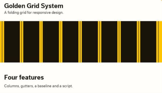
Golden Grid System
Skeleton
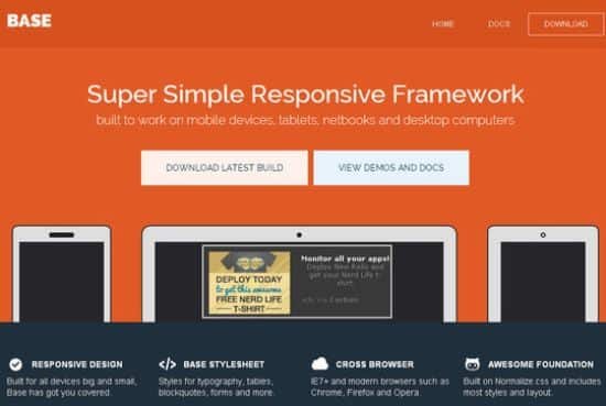
Base
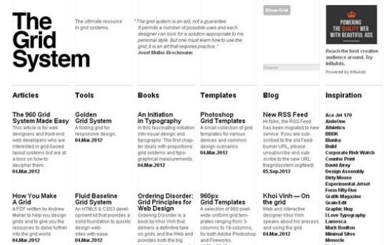
The Grid System
Less Framework 4
Gumby


