Beautiful Web Design
Thousands of new websites are joining the web almost every day. Most of them are unique, but many stand out from the rest in terms of their innovation and design. Here are 4 examples of elegant web design that can easily grab your attention.
1. CyArk
URL: http://cyark.org
By: CyArk and Internet Explorer
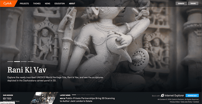
Both CyArk and Internet Explorer worked together to create CyArk. It is a 3-D archive of the world’s heritage sites. The website directly presents its objective on the homepage, running a presentation. It shows the major heritage sites it has archived into its library. This is supplemented by a simple menu and navigation system. As a knowledge-base site and online library, the website is an elegant one in addressing the cause.
2. Barlas Apaydin Web Developer
URL: http://www.barlasapaydin.com/
By: Barlas Apaydin and Team
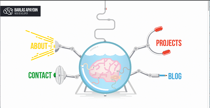
Barlas Apaydin is a web developer. He has created an innovative personal portfolio using a unique and innovative theme. It depicts a science project with armature extensions being used for navigating to other web pages. It is a vertical scrolling site with a Portfolio, Blog, About Us and Contact sections displayed on the same page. The Contact section at the bottom of the page is as simple, yet innovative as possible. The site makes use of solid pastel colors. It provides all the required information about his web development services on the same vertically-scrolling page.
3. Risotteria Melotti
URL: http://www.risotteriamelottinyc.com/
By: AQuest
When it comes to food, flavor and experience is as important as its presentation. Risotteria Melotti uses their website ideally to meet both these goals. The vertical-scrolling homepage does everything introduce you to scrumptious Italian Risotto almost out of the screen, enabling you to catch its aroma. All the navigation buttons have been condensed to a tiny handle on the left side of the screen, which opens the menu on clicking. The Play button on the homepage starts a splendid video, displaying the savory inventory of the restaurant.
A scroll down the page gives you a splendid look into elements of the Italian cuisine engrained into the restaurant. The website is an elegant piece of work, involving white background, grey capitalized font, use of subtle background pastel shades behind text, and the magnificent imagery created by striking photos, and a couple of videos.
4. Introducing Squarespace 7
URL: http://www.squarespace.com/seven
By: Squarespace
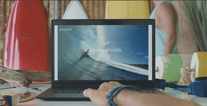
A technology website is least expected to be about colors and humans. But human emotions and needs are eventually the driving factors behind development of technology. Squarespace brings this point home through their site “Introducing Squarespace 7.” A creative tools designer and developer, Squarespace 7’s website uses an innovative yet simple layout and schema. Simple white background, light colored font, a traditional navigation, and the use of attention-grabbing colorful imagery are some of the main features of the site.


