Inspiring Web Designs
As the world of web designing seems to shrink in terms of creativity, more and more designers are coming up with almost unfathomable new designs. Here are some of the more unique and innovative websites that stand out from the rest. These examples are truly Inspiring Web Designs.
1. Van Gogh Museum
Url: http://www.vangoghmuseum.nl/en
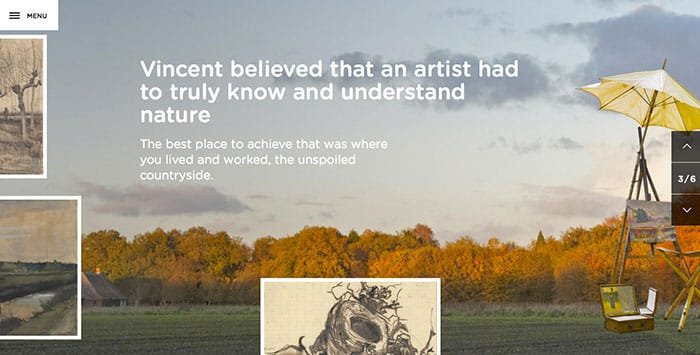
The Van Gogh Museum website brings the entire Menu list under a single head from where users can access the entire website. The use of a Van Gogh painting over the larger part of the homepage explains what is central to the site while the yellow panel covering the left side of the interface provides useful tabs for museum visitors.
2. Blue Host
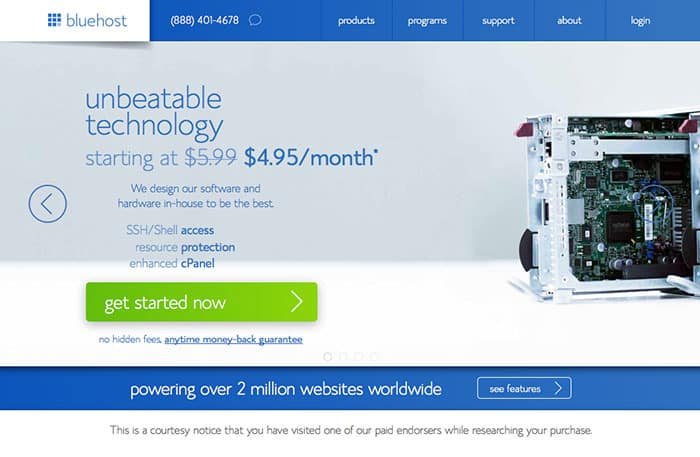
Visit a typical web hosting service provider’s website and you are most likely to be bombarded with information about their packages and prices. Visit BlueHost.com and there is less cluttering and more solutions. The site has a neat and clutter-free layout where the design is made entirely of three colors – blue foreground, white background and a couple of green action buttons. The design certainly plays an important role in the success of this one of the largest hosting service provider.
3. Hotel Style
Url: http://www.hotelstyle.biz/
If it’s about keeping things real (and not fancy), HotelStyle’s website accomplishes it in the best possible way. A black & white or dark video easily demonstrates and displays what the site offers – in a striking way. The menu bar has been shrunk onto the left side of the interface and drops down to present the options.
4. Black Negative
Url: http://www.blacknegative.com/
An intriguing web design from web designers, photographers and motion designers themselves, BlackNegative.com draws the user to its subtle use of the dark foliage. The Menu button at the bottom and the subsequent tiles give an easy and beautiful experience of how the company “tells stories” of its clients. BlackNegative.com stands out from the crowd when it comes to web designing.
5. Har Du Det I Deg
Url: http://hardudetideg.no/test/en.html
HarDuDetIDeg.no addresses the core objective of the site by directly putting the question (and the means to find the answer) on the homepage. A black background, the “start” button and the question in white text are all that the site takes its users through. The site conducts the so called interview by seeking answers and solutions to the problems in graphical forms.
6. Nike
Url: http://www.nike.com/us/en_us/c/jordan
When it comes to sports, solid colors continue to play an important role in web designing. The Nike site goes a step further and includes a combination of solid and pastels. But the dark essence of black, whether in backgrounds or stripes is almost everywhere. Conventional, browser-length menus are intact but the design helps highlight the purpose of the product through some effective analogies.
7. 4mula Design
Url: http://lab.4muladesign.com/dribbble/
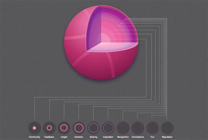
The 4mulaDesign site makes use of the striking color contrast between the background and the foreground elements. But the design provides an interesting demonstration for the users.
Conclusion
You’ve seen some of the most Inspiring Web Designs out there, by the top designers and developers in the world. Which one is your favorite? Feel free to share your thoughts in the comments section below.


super nice list of inspiration, thanks for sharing mate!!