Bootstrap Table With Hover
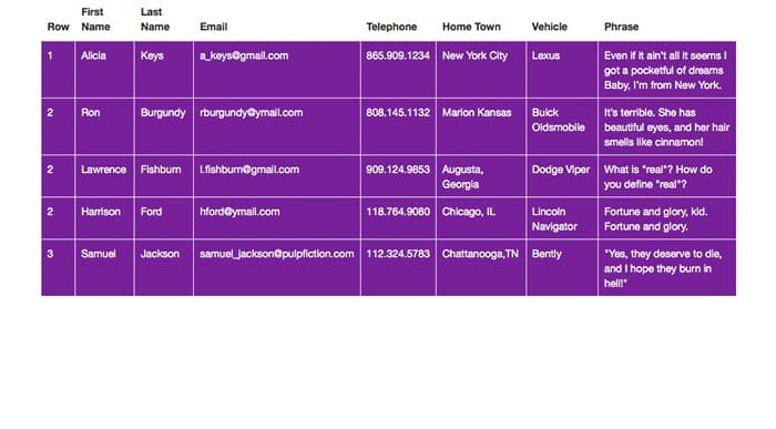
For the longest time, anyone who wanted to use a table to display data had to settle for a non-responsive display. Fortunately, frameworks like Bootstrap enable you to create responsive tables fairly easily. If you want to create a responsive Bootstrap table, you’ll need to understand how they work. Let’s take a look at the table we’ll create below, and I’ll talk about how to create it.
You’ll want to create a wrap, a section, a container div, and a div with the class of row so it spans the width of the container. We’ll also create a div with the class of table-responsive. Inside of that, we will create a table class of table hoverTable. Once you have all of the container and structure divs set up, you can begin to build the actual table structure.
Bootstrap Table Structure
You’ll start with a table head. Inside of that, you’ll create a table row. Then, for each column, you’ll create a table heading. This is going to be the title at the top of each column.
<thead>
                                <tr>
                                    <th>
                                        Row
                                    </th>
                                    <th>
                                        First Name
                                    </th>
                                    <th>
                                        Last Name
                                    </th>
                                    <th>
                                        Email
                                    </th>
                                    <th> Telephone</th>
                                    <th> Home Town</th>
                                    <th> Vehicle</th>
                                    <th> Phrase</th>
                                </tr>
                            </thead>
Next, you’ll create a table body. Inside of that, you’ll create a table row. Then, you can enter your values, wrapped in the table data attribute. However many rows of data you have is how many of these sections you’ll need to create. Don’t forget to close all of your tags and divs.
<tbody>
                                <tr>
                                    <td>
                                        1
                                    </td>
                                    <td> Alicia</td>
                                    <td> Keys</td>
                                    <td> a_keys@gmail.com </td>
                                    <td> 865.909.1234</td>
                                    <td> New York City</td>
                                    <td> Lexus</td>
                                    <td> Even if it ain’t all it seems I got a pocketful of dreams Baby, I’m from New York.</td>
                                </tr>
Now, it’s time for the CSS. We want the text to be white, so we need to style the table data, adding a background color of purple behind it, and a white border. For the hover, we just add :hover and change the colors. This way, when someone hovers over the table cell, it will change colors, which is important for indicating where someone is. If you wanted to highlight an entire row at a time, you would change td to tr, for table row.
td{
color: #fff;
background:rgba(121,1,147,1.00);
border:1px #fff solid;
}
td:hover{
    background:rgba(255,234,0,1.00);
    color: #7D0091;
}
Conclusion: Bootstrap Table
How did your responsive Bootstrap table turn out? You can apply different styles and hover effects to your tables to make them stand out. If you have any questions about create a Bootstrap table, please leave them in the comments section below. Also, you can view a live demo, or you can download the source files below.


