Beautiful Web Design
It’s been a while since I’ve been inspired to write a post like this one. There seem to be a lot of sites out there that emulate each other. I was pleased that I stumbled across some sites that were truly unique and well designed. In this post, I’ll share with you the latest collection of beautiful web design examples.
El Rey Network
Not only am I a huge fan of the network, but I am a huge fan of their site, too. It’s bold, with a powerful personality that matches the atmosphere of the network itself, along with the branding. It is bold, gritty, and in-your-face. On top of personality, everything is well organized, making it easy to find the information you’re looking for.
Digital Telepathy Blog
I just stumbled upon this site a couple of days ago, and I am happy to say that I love their approach. Their website is fresh, original, and fun to explore. There are tons of visuals, making it a site that combines two different worlds. The first is great content, while the next one is eye candy. Digital Telepathy packs a one-two punch that makes you want to come back and visit each day, just for the experience.
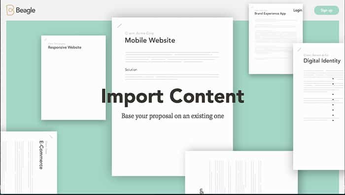
Get Beagle
For a company that embodies great proposals, they needed a website that could be considered a get proposal itself. This site is fantastic, with a sleek presentation. They walk you through the process and how everything works. The animation is fun and interesting, accentuating the presentation, not detracting from it.
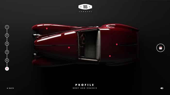
TimeShift
Timeshift is an incredibly interactive experience. From a great scrolling experience, to clicking and dragging to reveal the car from under a sheet, you’ll love the style of the site. My only qualm about the site is waiting for it to load in the beginning, but the experience is well worth the wait.
Well Storied (Land Rover)
Pictures and graphics don’t sell products, stories do. Land Rover Knows that, so what they did is simply brilliant. They put together an interactive map, connecting owners and their stories with people who come to the site. The site connects social media, stories, owners and new buyers, which is a brilliant and unique idea.
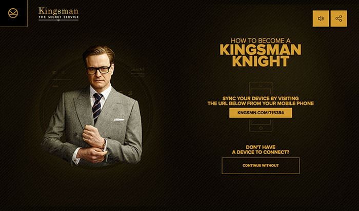
Kingsman
To celebrate the launch of the Kingsman movie, they launched a completely interactive site. It combines missions and Google maps. The site matches the style and flair of the movie and allows an immersive experience. The entire project had to be a huge undertaking.
Be More Human
By Reebok, Be More Human is a project that looks at bettering yourself, and being more natural. It encourages real life and encourages people to show themselves in less perfectionist situations. For example, instead of a picture perfect selfie, they want you to show yourself while you’re sweaty, vulnerable, and more human. The filter effects as you scroll are great.
Conclusion
I bet you were inspired by these awesome sites as I was. These examples of beautiful web design show what you can do when you stretch the limits and the bounds of what is doable in web design. Which one of these beautiful web design examples were your favorite? I’d love to hear what you think. Feel free to leave your thoughts int he comments section below.


