Practical: Parallax Free WordPress Theme
Many times, you’ll look for a WordPress theme, not because you want crazy layouts or special effects, but because you want a site that looks clean, professional and well-designed. Many times, we just want a simple, practical WordPress theme that makes our content look great. The Parallax free WordPress theme by ThemeIsle does that, which is why I made it the theme of the week. Let’s take a look at the features of Parallax and everything it has to offer.
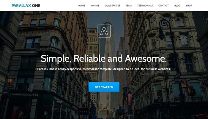
The popular trend right now is to have a large, bold header image. Not only do you have that, you you have a nice call to action button and a large, bold message to pull visitors in. I like how you can place an icon or a logo mark to represent your brand. Underneath, you have a row dedicated to logos of companies you’ve worked with, which builds trust with potential visitors. People like to see who you’ve worked with and that you are experienced in your field.
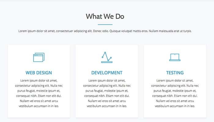
You can have a section that showcases your best skills. You can place a brief message about what you do and how you can help your clients.
The team section looks great. The images are simple squares. They have slick hover effects that show the title or name of that person and their job title.
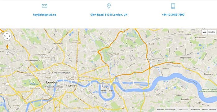
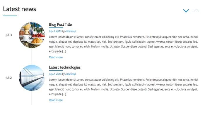
The site ends with a bold call to action, enticing visitors to do something. After that point, it shows feature blog posts, as well as a live Google map for displaying your location and the surrounding area.
Conclusion
Overall, The Parallax Free WordPress theme is clean and simple. It has a consistent look from start to finish, making it a great theme for designers or agencies. With client logos and testimonials, you’ll build trust with visitors easily. To see a live preview or download, click the links below.


