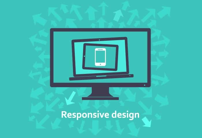

Responsive Web Design
Today, more than half of the internet users worldwide use their smart phones and other mobile devices to look around the internet. It is this staggering increase in the number of mobile internet users, that now urges organizations to create a presence on mobile internet just like on the desktop internet world.
This brings us to a responsive website design, which is actually a website that is integrated with a system, which reacts to the size of the user’s screen. This way, a responsive design enhances the user experience of your website, by optimizing the website to preview perfectly on any mobile device.
Here are some benefits a website with a responsive design can get you!
More Sales And Conversions
One of the prominent benefits of a responsive design is that users get an enhanced website experience, as there is no need to redirect them to a new page. Moreover, a responsive design means a more consistent look throughout. Consequently, the great user experience has a positive effect on the conversion rates and you can witness a noticeable boost in sales.
Reaching Out To Mobile Users
This is by far the most important benefit responsive website designs have to offer, as previously whenever a user visited your website, they needed to be redirected (to a mobile website). On the contrary, a responsive design can be used across all channels.
Additionally, tablet sales and smart phone sales are expected to keep on increasing in the near future. This means that a responsive design is now more important than ever. It allows you to reach out to your audience with a consistent looking website with great functionality.
You Can Cut Down Time On SEO
SEO campaigns can cost you a lot of time and money; it is not easy showing up on top of search results. By creating a responsive website, you don’t need specific SEO campaigns, rather you can do that with a single set of hyper-texted links.
Moreover, as SEO is all about content quality, you can cut down time and costs by using the same content on your desktop and mobile pages. This increases your chances of showing at the top of most search engine results.
Recently, Google also explained that mobile optimized websites, which are responsive, are being featured in prominent ranks on search results. This means that you should start considering getting a responsive design website!
Cut Down Time And Cost On Mobile Development
Another prominent reason behind using a responsive design is that you can cut down the time and cost which you would have used for designing a stand-alone mobile website (the traditional way). One responsive design can work for all of the platforms!
With tablets and smart phone sales going off the charts, it is essential for all businesses to utilize a responsive web design. This is an important step towards ensuring that your website renders perfectly on all devices and your customers don’t need to face trouble when looking you up!
Responsive Web Design Isn’t Difficult
Responsive web design has been around for a while, and many different designers and developers have created awesome responsive frameworks to help you build responsive websites quickly and easily. Some examples are Foundation, Bootstrap, Gumby, Skeleton, and more. If you want to build a responsive WordPress theme, there are tons of bootstrap and foundation based WordPress starter themes out there to get you on your way.
It’s Considered Standard Now and Has Been for a While
Responsive web design is so important and so beneficial that it has become the standard for website design. In fact, I don’t know of any sites that aren’t responsive. If they aren’t, they are usually looked upon with scrutiny. So many viewers are mobile now, you can’t get away from the need to have a responsive site.
Thanks for this post.
Here are some more benefits of responsive design:
Improved user experience (UX): The main reason is of course to provide a positive UX to users regardless of the means and mode of access to our page.
Cost: Although more expensive than a traditional site, the solution of responsive design may be more economical than one trying to create separate pages and applications for each device.
Future-proof!: A responsive site will adapt to any new device or screen resolution developed in the future.
Consistency: Responsive design offers the user a single “image”, a single brand, a single design and a single content regardless the device he/she is using.
What do you think?