CSS Transitions
One of the biggest new features of CSS3 are CSS transitions. The idea of being able to implement animation effects with css is exciting, because the idea of having animations that are cross-browser compliant is fairly new. This can give you the ability to create subtle animations that will wow your visitors. It is fairly easy, you just have to set things up properly first.
CSS Transitions: Background Transition
Below, I have a basic html document. I am just going to style the background property and have it repeat, so that you can see the effect.
<!DOCTYPE html PUBLIC "-//W3C//DTD XHTML 1.0 Transitional//EN" "http://www.w3.org/TR/xhtml1/DTD/xhtml1-transitional.dtd">
<html xmlns="http://www.w3.org/1999/xhtml">
<head>
<meta http-equiv="Content-Type" content="text/html; charset=UTF-8" />
<title>Untitled Document</title>
<link href="transition.css" rel="stylesheet" type="text/css" />
</head>

<body>
</body>
</html>
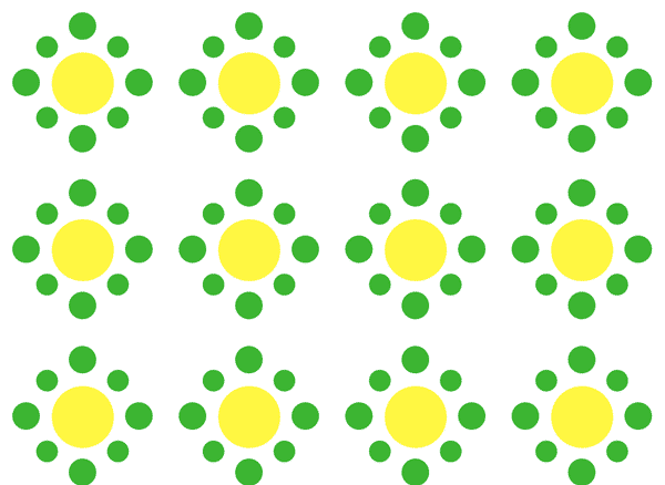
I have created 2 small PNG files. They are both of a couple of circular elements, and I saved them as transparent PNG files. One is yellow and green and the other is blue and purple. You can view the images shown below.
You have to define the CSS rule that you are applying the transition effect to. We are applying ours to the body. This is what we will define and control in our css. Next, you have to select which property that you want to place the transition on. For this tutorial, we are choosing to transition the background image. Define this in your css and point to the proper PNG file in your images folder.
Next, set the duration of the effect. This determines how long you would like it to take for the effect to transition. You can also set it to delay. I set this value to 1 second. You have the option to choose between seconds and milliseconds, which are typical in animation. The last option to choose from is the timing function, which determines if an item eases in, eases out, if it is linear, etc.
The next thing that needs to be done is to select the end value. This determines what the end result of your transition is. If you don’t want to use images, you can also transition most CSS styles, such as color, width, etc. The problem is that since we had never defined a background image to start with in our stylesheet, we need to go back and specify one. Below is what the CSS looks like so far.
@charset "UTF-8";
body {
-webkit-transition: all 1s ease-in 1s;
-moz-transition: all 1s ease-in 1s;
-ms-transition: all 1s ease-in 1s;
-o-transition: all 1s ease-in 1s;
transition: all 1s ease-in 1s;
}
body:hover {
background-image: url(images/alt-b-p.png);
}
We specified the hover image, but now we need to define the base image that we will start with. In the 1st body style, insert the following CSS:
background:url(images/normal-g-y.png);
The result depends on the browser that you are using. I have found that in Firefox, the transition is subtle, and it seems to ignore the ease-in effect. It still transitions from the first image to the second one. In Safari, however, the background delays and transitions smoothly from your beginning image to your final image with an ease-in effect in place. The result is shown below:
Starting background:
You can always go back into your CSS and edit anything that you want, even the css featuring your transition, and define other rules, such as background position, no-repeat, and just about any other rule you can think of. Just because you defined a transition for a specific rule that you can’t apply other rules to it.
CSS Transitions: Animate a Text-Shadow on Hover
An interesting effect for your header (or any text) is to animate a text shadow behind it. In the example below we will change the flat text into dimensional text with a shadow transition.
The CSS on the normal state:
h2, h2 a{
	color:#CCC;
	font-family: Arial, Helvetica, sans-serif;
	text-decoration: none;
	-webkit-transition: all 2s ease-in .5s;
	-moz-transition: all 2s ease-in .5s;
	-ms-transition: all 2s ease-in .5s;
	-o-transition: all 2s ease-in .5s;
	transition: all 2s ease-in .5s;
}
The CSS when you hover over the text:
h2:hover {
	color:#9CF;
	text-shadow: -2px 2px 3px #333;
}
The result is a smooth transition from a flat body of text, to a dimensional drop shadow behind the text. See the examples below:
On Hover:

The interesting thing about these transitions is that when you hover over the text, it transitions smoothly, but it also transitions smoothly back to is normal state when you take your mouse off of the element. It doesn’t just change instantly back to the normal state, but transitions gradually back to its original state, in a smooth and fluid manner.
Conclusion
Using CSS transitions isn’t as widespread yet, due to its youth, but it is catching on quickly. One thing to keep in mind is that not all CSS rules are available to transition. It would be a good idea to look into the ones that do, via W3schools.com or another reputable CSS website. Keep in mind that CSS transitions don’t display consistently across all browsers, so be sure to use this sparingly. Set your css and your site’s design up so that this isn’t a necessary feature. Honestly, you shouldn’t really use any feature just because you can. if you have any questions about CSS transitions, leave you thoughts and questions in the comments section below. Also, I have provided the source files for both tutorials below.


