My main design blog needed a complete overhaul. I tried doing this couple weeks ago, but I found out that my main blog posts weren’t even showing up. People couldn’t even get to my content! Thankfully, this was brought to my attention and I decided to redesign my website. This is where I ran into some CSS errors, and I had to find out where they were and how to fix them.
I’ve been using CSS for quite a while. I know the ins and outs of the different elements, as well as the styles that you can pull off using CSS. A lot of times I will handcraft the CSS for a client website. Since I was redesigning my main design blog, I decided that I would handcraft the CSS for this as well. I wanted a specific experience for tablet and cell phone users.
For the desktop version, my main content area would be 60% wide, and the sidebar would be 33% wide. The entire site would be full-width at 100%. There would also be a 7% left margin for the content area, to take into account the social sharing buttons that are in a vertical column on the left side. I wanted this to carry over into the tablet layout when it is in landscape mode.
All of this worked seamlessly. I was able to pull it all off with very little effort. The trouble came when I decided to craft the portrait layout of the tablet. I still wanted a left margin, but I also wanted a right margin as well. I did not want the wording to go from edge to edge, because it just didn’t look or feel right.
I went into the media queries section of my CSS. I set a left margin for the main content area. Then, I set the width of the content itself to be 85%. After saving everything, I went to check out the experience on my tablet. I was baffled when the content area was still only 60% of the width of the portrait mode of my tablet. I used Firebug to try to diagnose my CSS issue, but I couldn’t figure it out from that. It didn’t make any sense. I even went in and even though I know it is wrong to do this, I added !important at the end of my CSS.
To my dismay, it still didn’t work! Now I was really baffled. After a few more minutes of monkeying around with the CSS, I decided to take a different approach. I realized it had to be something with the structure of my CSS itself. So I decided to look online for a tool that would fix my CSS errors.

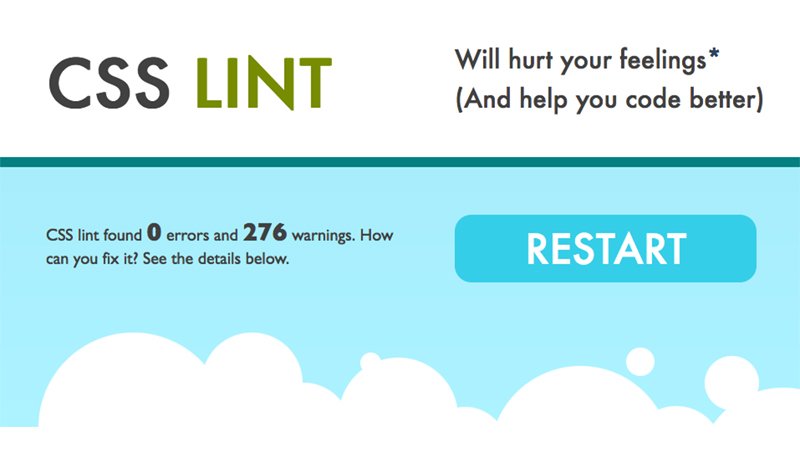
I came to a tool online called CSS Lint. If you’ve never heard of it, you should definitely check it out because it is an awesome tool. I copied all of the CSS from my child theme, and pasted it into CSS Lint. Then, I simply click the button and watched as it inspected my code.
It turns out that CSS Lint found an error! Turns out I had accidentally added an extra bracket in the media queries section. I don’t know about you, but that second set of brackets always throws me off somehow. It’s easy to get confused and forget to add the closing bracket, or to add an extra one.
What’s awesome about CSS Lint is that it tells you what line of your code has an error. This makes it super easy to drop into a code editor like TextWrangler, find the code you’re looking for, and fix it. That’s exactly what I did. Once I had fixed it, I copied all of the CSS and went back to my theme and dropped in the newly fixed code. I saved it, and then I refreshed my tablet. Voilà! My site looked exactly how I wanted it to look on my tablet. This is something that could’ve easily taken me an hour of combing through the code to find. However, with CSS Lint I was able to find the error and fix it in a matter of just a couple of minutes.
What do you use to inspect your CSS? If you make a mistake, what do you use to find your error? I’d love to hear your input on this. Please leave a comment and share your stories of CSS blunders, problems and how you fixed them.

