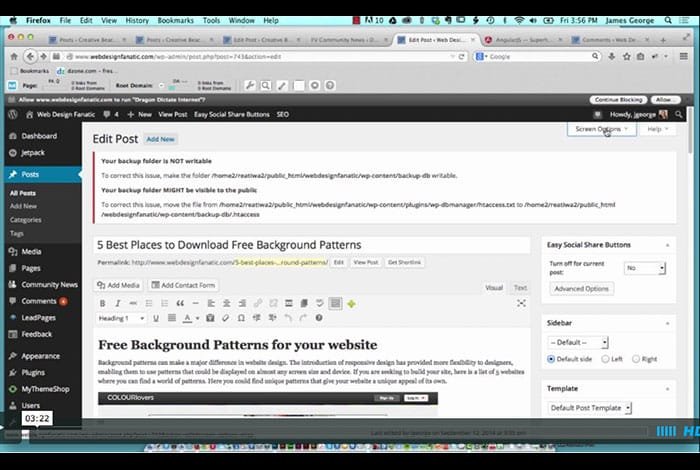
Expanded WordPress Editor
Everyone is rejoicing over the new WordPress Update to 4.0, called Benny. The other day, I mentioned that I liked the update over all, but there are 2 features I disliked tremendously. One was the image editing buttons that appear when you hover over images in the editor. The other one is the expanded WordPress editor, that scrolls as you scroll. The problem with this is that if you create a long post, you have to scroll all the way through your post to reach panels underneath it. Thanks to a reader, I’ll share the solution to the expanded WordPress editor.
I looked for solutions to this problem myself. The problem is, I was looking for a code solution, not an interface options solution. I never would have thought they would have placed the option to turn off the expanded WordPress editor under screen options. All I care about is not having to deal with this issue on a daily basis. It really isn’t very user friendly. If you write long posts like I do, then you know what I mean. Having to scroll through a 5000 or 6000 pixel post to get to lower panels is frustrating. This is especially true if you have to scroll up and down to make changes and adjustments.
With this simple tip, sent to me via Beka at SellWithWP.com you can solve this usability problem. I like the old format, which I am used to, and I don’t see the need to use the new way. It isn’t beneficial to me at all, so I needed to get rid of it. Use the screen options section to format the post editor and admin section to your like. You can select options that aren’t active, and you can disable parts that you aren’t using. Do you have any tips for optimizing the user experience in the WordPress editor? Feel free to share your tips below.


