Fullby Free WordPress Theme
I decided to start a weekly post showcasing the best free WordPress theme I could find each week. Having a great WordPress theme will enable you to showcase your products or content in the best way possible. However, it can be tough to find a quality free WordPress theme that doesn’t look like every other WordPress site out there. This week’s WordPress theme is called Fullby by Andrea Marchetti, and it has a unique, powerful appearance from the first glance. Fullby is built with Twitter Bootstrap and Font Awesome, and it looks great. It is 100% responsive, and the three column header contains your 3 latest featured posts.

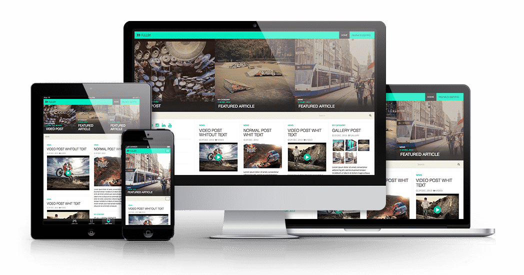
As you can see from the preview above, the Fullby free WordPress theme has a multi-column layout, and a great featured content center. To add your latest content to the featured section, all you have to do is check the “featured” option inside of your WordPress post. Fullby also has gallery and video support, so if you are showing off your work in a portfolio format, Fullby can do that for you. Fullby also comes with a Popular and Latest Post widget, which a lot of themes have, but it is good that they still included it in this one. your best and most popular posts will always be there to get a lot of attention and encourage people to visit multiple pages in your site. Fullby also has a few little extra details, like the social media icons in the far left column, and the zoom effect when you hover over an image in the featured posts section.
Download the Fullby Free WordPress Theme
To download, click the button below to be taken to the download page. Fullyby is free, and it would be a good idea to keep checking back in to the site every once in a while, because the developer is promising to add new features as she goes along.
I was wondering if you ever considered changing thhe page layout of your website?
Its very well written; I love what youve got too say. But maybe you could a little mlre
in the way of content so people ould connect with it better.
Youve got an awful lot off text for only having one or 2 pictures.
Maybbe you could space it out better?
I appreciate your suggestions, and I’ll take that into consideration for the future. Thanks for your input!