Editor Free WordPress Theme
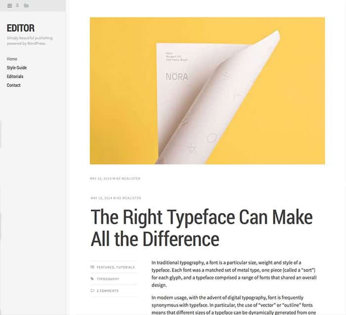
Whether you are an avid blogger, or you keep an online journal, a clean, well-designed WordPress theme will go a long way. You need something that will be easy for visitors to read, without having a cluttered layout. It’s also important that your theme looks great on all devices. With 75% of Internet traffic coming from mobile users, it’s important that your site is mobile ready. That’s where the free WordPress theme of the week comes in. The Editor free WordPress theme by Array is a beautiful, minimally designed WordPress theme with everything you could ask for in a simple blog format. You can view a screenshot of the editor free WordPress theme, shown below.
One of the most important things about Editor is that it is responsive. It looks great on all devices, and allows the focus to stay on your content and not on flashy designs or effects. To set up the Editor free WordPress theme, you don’t need any web coding skills. You can customize the look and functionality of Editor by using the Customizer feature in WordPress.
The sidebar area is important to note, because it stays in place while viewers scroll. This allows for your links, widgets, and other sidebar content to stay within easy access at all times. You can choose your own colors, and you can upload your own logo making the site you’re out.
The Editor free WordPress theme is built with valid HTML5 code, and it even includes the Sass files. This theme is also infinite scroll compatible, which allows users to simply scroll for more content.
If you’re looking for a WordPress theme where your content is what’s on display, the Editor free WordPress theme is a great choice. The typography in this theme is excellent for making your blog posts easy to read. You can see a live preview or download this theme via the links below.
Editor Free WordPress Theme
-
Editor Free WordPress Theme
Summary
I really like this theme, don't get me wrong. However, I think that there should be a little something to make it stand out a little more. The theme is great for its minimal design, but it almost seems too minimal. I think it could use a little something, such as custom minimal share buttons, or something to add to the experience.


