Web Design Inspiration
We all need a little inspiration sometimes. Sometimes it just takes a little inspiration to get the creative juices flowing. What better way to get inspired than to view great examples of web design work? Gathering inspiration from outside sources can help you to see things in a different light. This collection of inspiring web design will get your creative juices flowing and show you some amazing web design work.
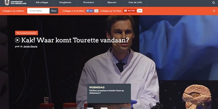
Universiteit Van Nederland
The University of Neatherland is the first example of awesome web design inspiration. It has a clean layout with big images Annawana interactive elements. One example is the different boxes that slide upward when you have religion as you can see in the screenshot of that.
Grove Made
Grove made is an inspiring handcrafted Sacht. Every image that you see here is the site and appearance of craftsmanship. They sell handcrafted and handcarved iPhone cases. Showing the tools of the trade really gets a sense of all the work that’s involved with creating each iPhone case. The visuals in this website are excellent.
Grain And Mortar
Graine and Morder has an interesting atmosphere to their website. You get a sense of fun and hand craftsmanship at the same time. The typography and the imagery in Igraine and Morder’s website are picture-perfect. The subtle accents spread throughout the site such as the small icons in the handcrafted typography make this an NExcellent specimen.
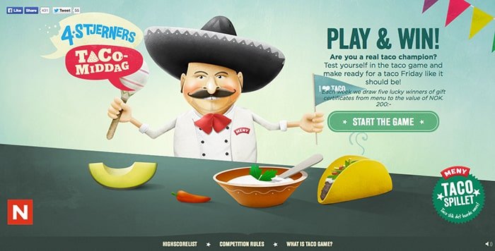
Tacospillet
Taco spell it is an excellent website with the lot of textures. Elements move about the page and really draw you into the site. Combine that with the rich textures in the Corkey illustrations you can’t help but explore the site.
Frangrance.ly
Fragrance.L why is a simple but effective website. It uses parallax scrolling and the images used in the background are subtle but still stand out and catch her eye. The flower illustrations in the background have a watercolor look to them that looks authentic.
John Deere: 7r-8r
The John Deere tractor website is an excellent example of picture-perfect branding. The signature green and yellow are spread out through the site and used in subtle ways to give it a high impact design. Mixed with black and white this side seems to be framed perfectly. As you scroll through the site different elements move in and out of view. This gives the site and also an interactive quality.
State Puppet Theatre
The state puppet theater website is beautiful. The logo in yellow bar transition from the top of the browser down to the bottom all the video plays in the background. Despite the rather creepy puppets that you see in the video state puppets theater is sleek and elegant.
Glyn Iliffe
Glyn Iliffe has created an amazing website for their work. The powerful imagery get your attention and when combined with the textured parchment elements throughout the site you get a true old world experience. The detail of the scroll images looks authentic and is a great way to showcase the sites information and content. This site is a great example of form in fuck function mix together.
Today, we’ve seen some excellent examples of web design inspiration. From simple and technical to handcrafted beautifully illustrated or highly interactive these sites show what happens when you mix interactivity and creativity to build web solutions. Which one of these awesome websites were your favorite. I would love to hear your opinion. Leave your thoughts in the comments section below.


