
About the Zurb Redesign
If you’re not familiar with Zurb, they are the makers of the responsive framework called Foundation, which is currently on its 6th version. Zurb has come a long way over the past few years, but they recently decided to redesign their company site. This has caused a stir, because many people are worried about the future of Foundation. We’ll take a look at the new Zurb redesign, and what it means for such an important organization.
Most Important: Foundation 6 is Still Here
Many people speculate whether Foundation will continue to evolve over time. While the new site design mentions little of Foundation, it is still there. With so many huge companies using Foundation, it would be silly for Zurb to drop that project.
My thoughts are that while Foundation for Email and for websites is a cornerstone of what they do, Zurb wants to remind people that they have other things they are involved in. The first thing they mention is that they help companies build exactly what they need, especially complex projects. In the 1st section of their site, Zurb Mentions 8 core things they can help any business with:
- Web Applications
- Data-Driven Sites
- eCommerce Sites
- Web Portals
- Mobile Apps
- Email Design
- User Advocacy
- Emerging Technologies
Other Things Zurb Has Done
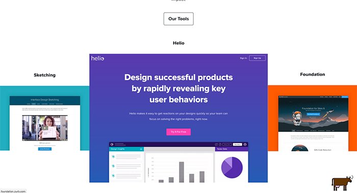
While Know for Foundation 6, they also have created Helio, for user behavior understanding, and Sketching, to help designers and companies to push projects onward. Sketching is actually a course that they provide to help you get past road blocks and solve problems for creating just the right interface for your project. Everyone needs a system, and Zurb will teach you theirs, and they’ll do it for a reasonable price. Why not learn a system used, developed and taught by some of the best in the business?
The Site Redesign
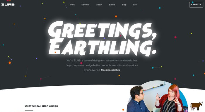
Overall, the new design is really clean. One of the coolest parts of their design is the particle-style header. When you move your cursor over the header, points will follow your mouse. Other than that, the website is pretty straightforward, with no extra bells or whistles. They use very large, bold headlines to get your attention, but they also sprinkle the logos of some of the biggest companies they’ve worked with to establish, and remind us of their authority. They have small little accents here and there, like a particle animation into an icon that seems to drop onto the page. Otherwise, they keep the bells and whistles to a minimum.
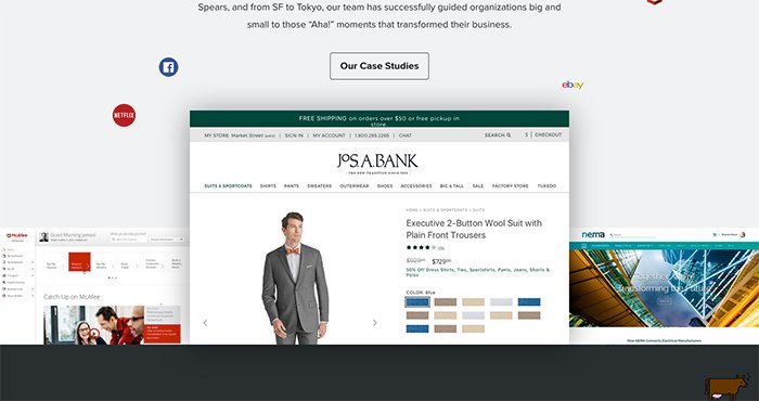
Their new site design is focused on their team, and the services they provide to businesses. They provide case studies from companies we recognize, like Jos A. Bank and McAfee, where they’ve produced stellar results. They touch on their process as a team, and they invite you to read more about that on a page dedicated to telling you all about their process. The final part of their new home page is a contact form for lead generation, so businesses can reach out and seek their help directly.
Conclusion
It’s important to understand that Foundation isn’t going anywhere, and that Zurb as a business is focusing on developing solutions for clients. Foundation still has everything you need, with all of its resources in tact.
What do you think of their new site design? Do you like the space references and theme? Leave your thoughts in the comments section below!